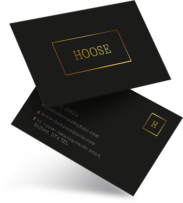
The Hoose
A modern, fine dining restaurant and bistro, The Hoose’s owners sought a fresh brand identity to tie everything together. This is how our proposal and solution hit the mark, both inside and out.
1. the brief_
Ranked as the number one bistro in East Belfast, The Hoose had developed a stunning interior and exterior transformation, which featured a modern and chic design. This created an atmosphere of comfort and quality to match its highly revered gastronomical menu. But they also needed its branding to fall in line with this fine dining aesthetic and tie everything together. With that in mind, they partnered with us and we kicked off the project with them at Platform Media HQ.
–
CLIENT
The Hoose
INDUSTRY
Hospitality
LOCATION
Belfast
TEAMS
- Branding | Graphic Design | Print | Signage

2. the plan_
BEGINNINGS
It was clear the image of the restaurant was missing a final piece. After our research and development process, our plan was to instigate a full rebrand, which would include a new logo that would then be displayed on new backlit outdoor signage, which we would design, build and install. It could also then be used across all new table menus and distributed on new business stationery to then eventually roll out to their social media channels. Defining how we portray the brand across multiple platforms and mediums is crucial to get a feel for how we can roll a new identity out within any development plan we undertake.
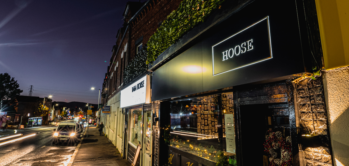
BRIEF DISTILLED
A timeless elegance / A fresh and simple
look for use across their business / Adaptable for use
across multiple mediums and platforms
TEAMS
Branding
Graphic Design
3. the design_
The concept began with the crucial aspect of aligning the brand with the business objectives, communicating that brand to the target market and maintaining the brand as a presence within the market. A timeless elegance / a fresh and simple look for use across their business / adaptable for use across multiple mediums and platforms, from their website and social media to their new signage and menus. The result? Fine gold text in a box logo composition, exuding class and contemporary design, especially when displayed against a rich, black background. This attention to the bold contrast makes the logo stand out across marketing platforms and branded materials.
4. the creation_
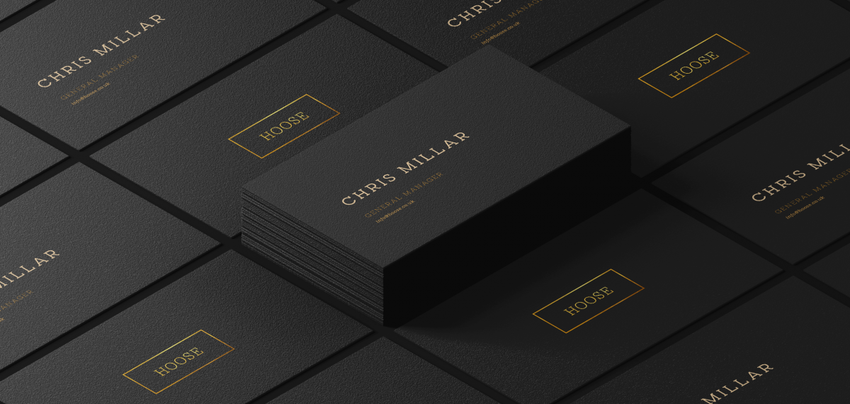
5. the roll out_
BRIEF DISTILLED
Simple and elegant, tying beautifully
with the aesthetic of the brand. Here we
captured the installation process.
TEAMS
Graphic Design
Signage
Video
6. the results_
This level of brand management can help build and maintain loyal customers regardless of changes in trends or customer behaviour. It was important that we got an in depth insight into The Hoose as part of our meticulous research. This is an all hands on deck process, where all departments get on board for a download of all the various strands of the customer’s business. This enables us to get into their mindset of where they are and create a vision which is aligned to the new identity and aims of where they want to be. Following this timeline, we partnered with The Hoose to complete the final piece of their overall plan and that was to create a brand which fitted with their high end offering. This is reflected from the exterior right down to on the menus their customers hold in their hands. The new logo pops in reflective gold, inlaid against the premium matte black soft touch card. Simple and elegant, tying beautifully with the aesthetic of the brand and bistro.
more projects_
Mortgage Solutions
Mortgage Solutions are a well established agency across Northern Ireland providing financial services to individuals and businesses, requiring new signage inside and out, to freshen up their dated displays while maintaining their well known brand message.
Caffe Zaza
Caffe Zaza is one of the finest coffee houses in the area, but on an avenue saturated with cafes it can seem difficult to get yourself noticed. Caffe Zaza already brewed an established brand, but it was time to take it to a whole new level.
Have a
project?
Fill out this form or get in touch by
phone or email.
Call us
028 9012 3576
info@platformprint.co.uk
